
Behind the artwork
From room to storybook
How space, painted surfaces and live belongings meet—and how the website carries the same care into a different medium.

Begin with a space that makes sense
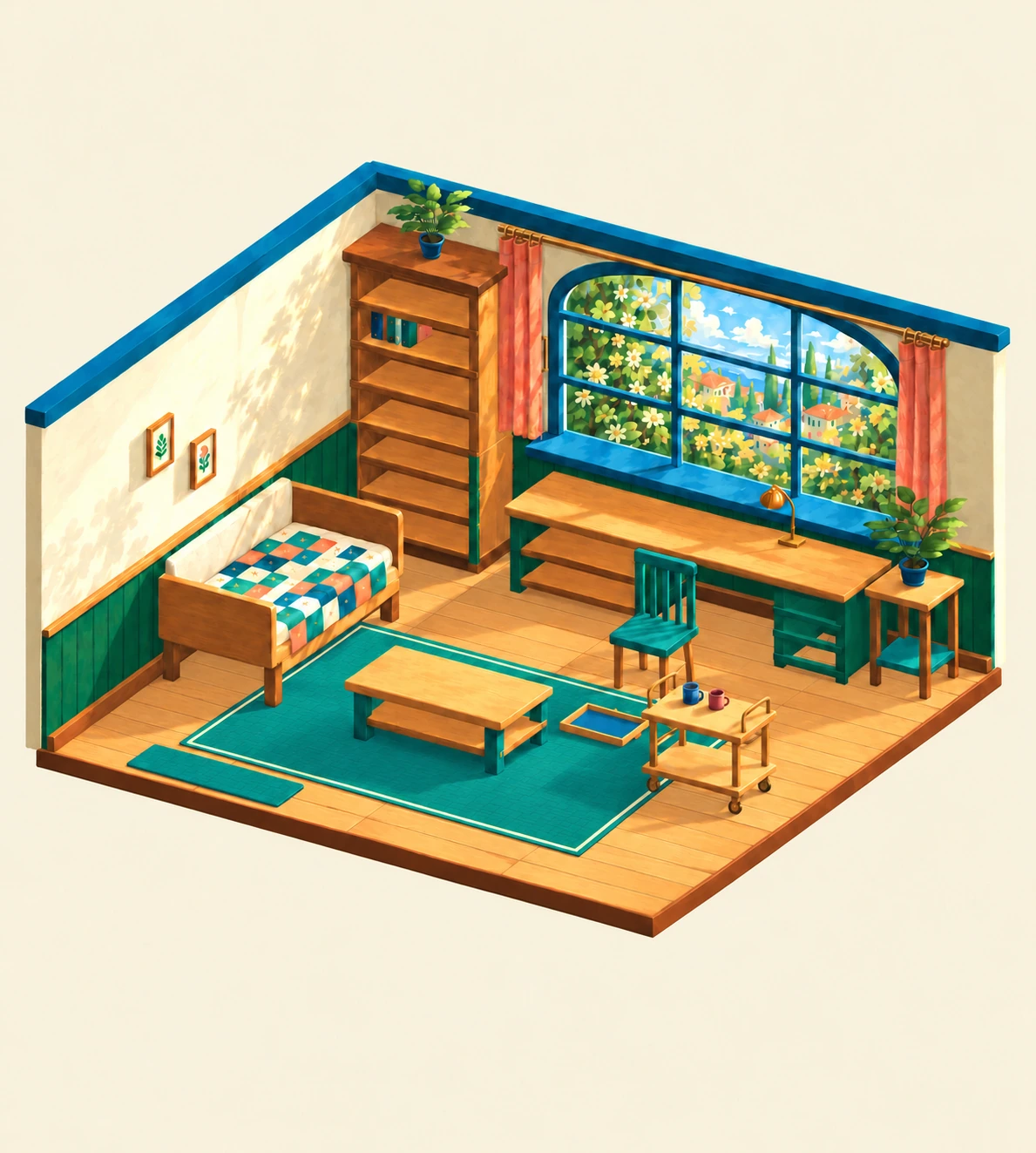
The painted rooms begin with actual geometry: walls with depth, useful furniture and openings that belong to the space. Readable silhouettes and believable proportions come before surface detail.
A shelf is more than the front edge in a picture. Its opening, occupied space and approach affect where a belonging can go. Establishing the room first lets the illustration and the arranging describe the same place.
The game uses authored fixed orientations with pan and zoom. Its painted layers are registered to that geometry. An attractive room poster with approximate depth would not supply the same agreement between the view and the objects you can reach.
Light and material carry the detail
The selected Graphic Storybook direction uses broad matte colour and intentional light. Timber, cloth, pottery and foliage need recognisable construction and different kinds of detail. Adding noise everywhere would make a small object harder to understand.
The rooms share an illustration language while keeping their own identities. A listening room, a mending workshop and a shaded loggia should not become the same layout with another name. Their purpose, architecture and belongings give the artwork something specific to express.
Leave the things that move alive
Movable belongings and opening fixtures remain separate from the static painting. Their poses, shadows and physical envelopes have to agree when something changes. A book that opens needs its own cover; a drawer needs an actual interior and space to travel.
Keeping these actors separate avoids painting a state into the scenery that the player can then contradict. It also lets the same room remain readable as the arrangement changes.
Shared object resources can help with consistent forms, but each room retains its own placement rules, object identity and save state. Reusing a visual does not move a possession from one neighbour’s room to another.
A different view for the website
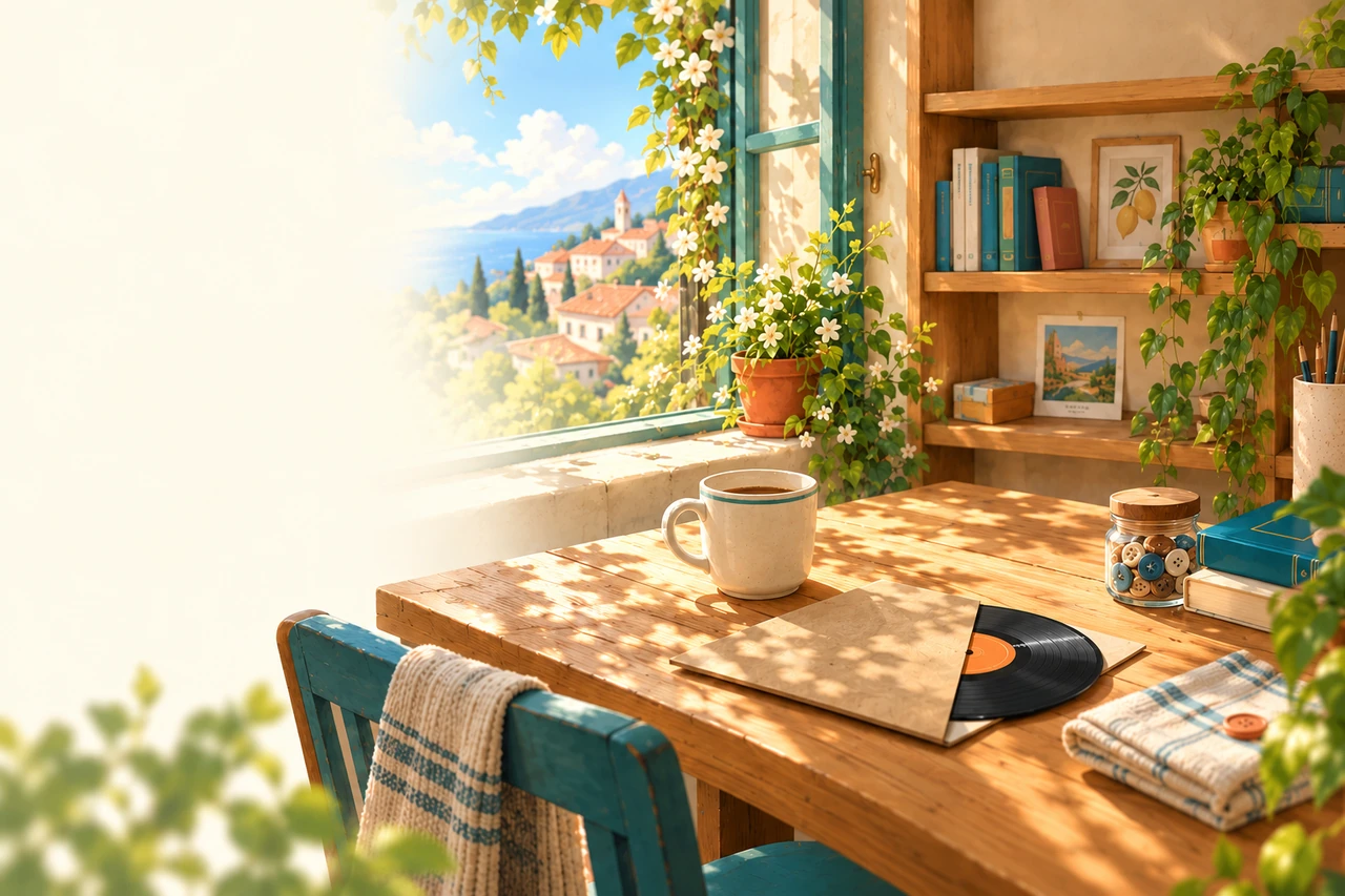
The website’s Sunlit Courtyard scene follows a camera through an opening and into a listening-room vignette. That moving perspective needs authored surfaces that remain coherent throughout the approach. Its current scene uses real geometry and whole-surface materials, with separate live actors for the record, lamp, book and sleeve.
The new reading pages use original website illustrations alongside existing game artwork. They keep the warm surfaces, deliberate lighting and depth of the home page while giving the text a quiet place to sit.
The categories stay visible. A website illustration introduces the atmosphere; a native development screenshot shows the game and its real interface. The source masters, prompts, material licences and capture records remain part of the artwork’s provenance.
A little more to explore
Come and meet the neighbours.
Discover the rooms and the arranging behind these stories.
Neighbours & Rooms